Website Design · 13 min read
The Ultimate Guide to Animated Web Design
Good animated web design is felt more than seen. It guides the eye, explains what just happened and makes a site feel alive. Bad animation slows people down. Here is how I use motion so it earns its place.

Key takeaways
- In animated web design, every animation needs a job: guide, explain or confirm.
- Keep UI motion short, around 150 to 300 milliseconds, and animate transform and opacity only.
- Respect reduced-motion settings and never block content behind an animation.
01Animated web design starts with the job, not the effect
Before I add any motion I ask one question: what does this help the visitor do? Motion is useful when it shows where something came from, draws attention to the next step or confirms that an action worked. If I cannot name the job, the animation does not go in.
- Guide: lead the eye to the main call to action or the next section.
- Explain: show how a panel opens, a card expands or a step changes.
- Confirm: a small tick, a pulse or a colour change after a click or a save.
Writing the job down helps. For each animation in a design, I add a short note: “guides the eye to the form”, “shows the menu opening from the button” or “confirms the item was added”. If I cannot write a clear note, the animation probably does not need to exist. This simple habit keeps animated web design purposeful and stops a site from turning into a showreel of effects.
Animation also carries brand personality. A financial service might use calm, slow fades, while a creative studio might use bolder movement. The job still comes first, but the style of motion should match the tone of the brand, in the same way colours and typography do.
It also helps to agree what should never move. Body text, prices, form labels and important buttons should stay where people expect them, so the page feels stable and easy to trust.
02Keep it short and natural
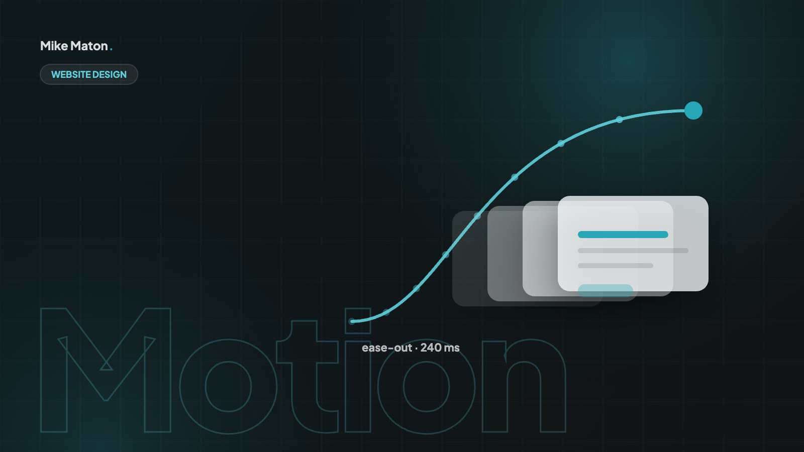
Interface motion should be quick. Most of mine sits between 150 and 300 milliseconds. Larger moves, like a full-screen menu, can take a little longer. Anything that makes people wait to read or click is too slow.
Easing matters as much as timing. Things in the real world speed up and slow down, so I use ease-out for elements entering the screen and ease-in for elements leaving. Linear motion looks mechanical.
A good test for animated web design: if you notice the animation on the third visit, it is probably too long.
Duration depends on distance and size. A small tooltip can appear in 120 to 150 milliseconds, a dropdown in around 200, and a large panel or full-screen menu in 300 to 400. Elements that travel further need a little more time so the movement does not feel jumpy, but anything over half a second starts to feel like waiting.
Consistency makes animated web design feel professional. Define a small set of durations and easing curves, for example fast, medium and slow, and reuse them everywhere. When every hover, dropdown and modal moves with the same rhythm, the site feels like one coherent product instead of a collection of separate effects.
Easing curves are part of that rhythm. A gentle ease-out for entrances and a quicker ease-in for exits feel natural to most people, while linear motion is best kept for things like progress bars and loading indicators.
Motion should answer a question the visitor already has: where did that come from, and what happens next?
Mike Maton
03Animate the cheap properties
Browsers can animate transform and opacity smoothly because they do not force the page to recalculate its layout. Animating width, height, top or margin often causes stutter, especially on phones.
- Move with transform: translate, not with top or left.
- Fade with opacity, not with visibility tricks.
- Scale with transform: scale, not by changing size.
Performance is where animated web design often goes wrong. When a browser has to recalculate layout on every frame, it drops frames, and the motion stutters, especially on mid-range phones. Transform and opacity changes can usually be handled by the graphics processor without touching the layout, which keeps animations smooth at 60 frames per second.
Test on a real phone, not only on a powerful laptop. Chrome DevTools can also slow down the processor to simulate a cheaper device and record a performance profile, which shows exactly which animations cause layout work. Use will-change sparingly, only on elements that are about to animate, because overusing it can increase memory use.
A quick way to check is to open the Rendering panel in DevTools and turn on paint flashing. If large areas of the page flash green while an animation runs, the browser is repainting too much, and the animation should be rebuilt with transform and opacity instead.
04Use scroll effects with care
Reveal-on-scroll and parallax can add depth, but they get tiring fast. I keep reveals subtle, run them once and never hide important content until an animation finishes. If JavaScript fails, the content must still be there.
Scroll-linked animation can support storytelling on landing pages and case studies, for example revealing steps in a process or numbers in a results section. Keep the content readable at every point of the scroll, never tie essential information to a specific scroll position and make sure the page still works if JavaScript fails or the animation never runs.
Parallax effects deserve extra care. Strong movement between foreground and background can cause discomfort for people with vestibular disorders, and it rarely adds much meaning. A subtle depth effect on a hero image is usually enough. In animated web design, less movement often feels more premium.
When reveals are used, keep them short and subtle, start them slightly before the element enters the viewport and make sure fast scrollers never see empty space where content should be. Content that has appeared once should stay visible when people scroll back up.
05Make motion accessible
Accessible animated web design matters, because some people get dizzy or distracted by movement. Operating systems have a reduce motion setting, and websites can read it with the prefers-reduced-motion media query. When it is on, I switch large movements to simple fades or turn them off.
- Honour prefers-reduced-motion for every non-essential animation.
- Avoid flashing content and endless loops near text.
- Give autoplaying video a visible pause button.
The prefers-reduced-motion media query lets you offer a calmer version of the site to people who ask for it. That does not always mean removing all motion. Fades and colour changes are usually fine, while large movements, parallax and auto-playing animations can be turned off or replaced with simple transitions.
Accessible animated web design also means keeping control in the user’s hands. Carousels should not rotate automatically, or should pause on hover and focus. Video backgrounds should have a pause button. Anything that moves for more than five seconds should be possible to stop, in line with the WCAG pause, stop, hide guideline.
06Pick tools that fit the project
Most animated web design needs nothing more than CSS transitions and keyframes. For richer timelines I use a small JavaScript library, and for illustrated animation Lottie works well. On WordPress sites built with Elementor, the built-in motion effects cover most needs if you keep them restrained.
CSS covers most needs: transitions for hover and state changes, keyframes for loops and entrances, and the Web Animations API when you need control from JavaScript. Scroll-driven animations are now possible in CSS too, which means many reveal effects no longer need a library at all.
For complex sequences, such as an animated hero with several elements timed together, a dedicated library can save a lot of work. For illustrated motion, like an animated logo or icon, Lottie files exported from After Effects are light and sharp. Whatever the tool, keep the total weight of animation code small, because every kilobyte affects loading time.
Whichever tool you choose, keep animated web design code in one place, document how it works and remove effects that are no longer used. Old animation scripts are a common source of hidden weight on long-running sites.
07Animated web design that converts
Animation can support business goals when it is used with intent. The main call to action can gently draw attention when the visitor reaches it. Form fields can confirm valid input instantly, which reduces errors and abandoned forms. A short animation on a pricing page can show what changes between plans. Each of these helps people decide and act.
The opposite is also true. Animations that delay content, distract from the main message or make buttons move unpredictably can lower conversions. In animated web design, I measure the effect of motion the same way as any other design change: by looking at real behaviour, such as clicks, form completions and time on page.
- Use motion to point to the next step, not to decorate.
- Confirm actions instantly, especially in forms and checkouts.
- Never delay important content behind an entrance animation.
- Test animated and static versions if a page is important.
08Microinteractions in animated web design
Microinteractions are the small moments of motion attached to a single action: a button that changes when pressed, a heart that fills when you like something, a toggle that slides, a field that shakes gently when the input is wrong. They are some of the most useful parts of animated web design, because they give instant feedback exactly where the user is looking.
A good microinteraction has a trigger, a response and an end state. The trigger is the user’s action, the response is the visual change and the end state shows what happened. Keep them fast, under 300 milliseconds, and make sure the end state is clear even without the motion, so nobody depends on seeing the animation to understand the result.
- Button press: a quick change in colour or scale.
- Form validation: a tick for valid input, a clear message for errors.
- Add to basket: a short confirmation near the basket icon.
- Copy to clipboard: a brief “Copied” label next to the button.
09Planning animated web design in a project
Animation works best when it is planned with the rest of the design, not sprinkled on at the end. Early in a project I list the moments where motion could help: opening and closing menus, moving between steps of a form, showing that something has loaded, revealing content in a case study or drawing attention to the main call to action. That list becomes a small motion brief.
Next comes a motion system, just like a colour or type system. It defines a handful of durations, two or three easing curves and the types of movement that are allowed, such as fades, small slides and scales. Writing these down means designers and developers make the same choices, and the site feels consistent even when different people work on it over the years.
Prototypes make animation easier to agree on. A static mock-up cannot show how a menu opens or how a card reacts on hover, so I build quick interactive prototypes or short screen recordings for the key moments. Seeing the motion at real speed on a phone is the fastest way to decide whether it helps or distracts.
Finally, plan how animation is tested and maintained. Every new component should respect the motion system and reduced-motion settings, and performance should be checked on a mid-range phone. When the plan is clear from the start, animated web design adds polish without adding risk, and it is much cheaper than fixing a heavy, inconsistent site later.
- List the moments where motion helps the user.
- Define a small motion system: durations, easing and allowed movements.
- Prototype key animations and review them on a real phone.
- Check performance and reduced-motion support before launch.
10Common animated web design mistakes
Most problems with animation come from adding it because it is possible, rather than because it helps. These are the mistakes I fix most often.
- Every section fading in on scroll, so content keeps arriving late.
- Long page loaders that hide content while animations play.
- Animating layout properties that cause stutter on phones.
- Ignoring reduced-motion settings.
- Using different speeds and easing on every element.
- Heavy animation libraries loaded on every page for one small effect.
The fix is usually to remove more than you add. Keep the animations that guide, explain or confirm, make them faster and more consistent, and let the rest of the page appear instantly.
11Animated web design questions
Does animated web design slow down a website?
It can, but it does not have to. CSS animations of transform and opacity are very light. Problems come from large libraries, video backgrounds, heavy Lottie files and animations that cause layout recalculation.
Is animation bad for SEO?
Not by itself. Problems arise when animation hides content until JavaScript runs, delays the main content or causes layout shifts. Keep content in the HTML, load it immediately and animate it gently.
How long should a website animation be?
Most interface animations should take 150 to 300 milliseconds. Larger transitions can take up to around 400 milliseconds. Decorative loops can be longer, but should never block reading or interaction.
What is the best tool for animated web design?
For most websites, CSS is enough. Use a JavaScript library for complex timelines and Lottie for illustrated animations. Choose the lightest tool that does the job.
How do I make animations accessible?
Respect prefers-reduced-motion, avoid flashing content, let users pause anything that moves for more than a few seconds and make sure every state is clear without seeing the motion.
Checklist
Before you publish an animation
- 1It has a clear job
- 2It runs in 300 ms or less
- 3It only animates transform or opacity
- 4It respects reduced motion
- 5Content is readable without it
Keep reading
More from the blog.
Your website
Want a site that gets this right?
Tell me what you are building. I will come back with ideas, a plan and a clear price.