The Beauty of Simplicity
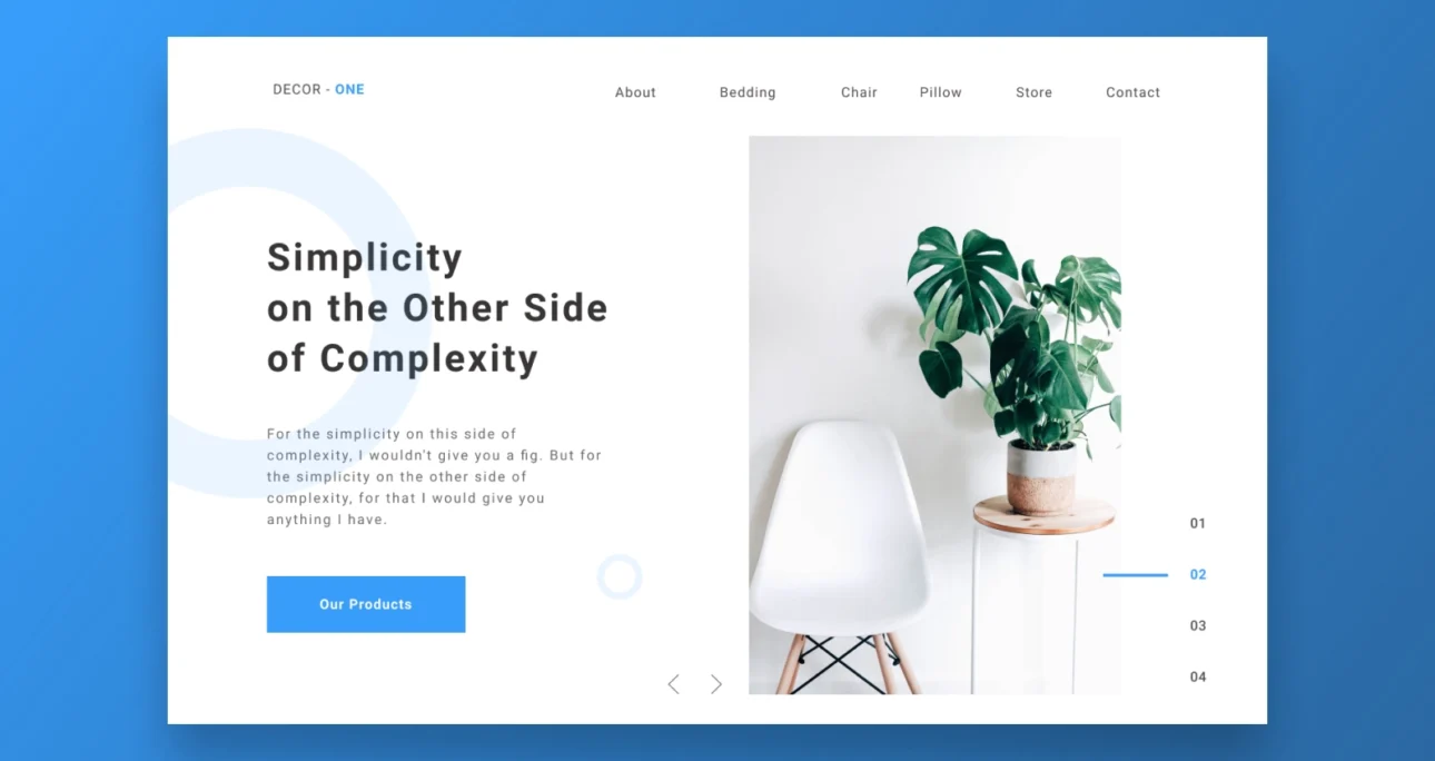
Minimalist design is a design style that emphasizes simplicity and the use of minimal elements to create a clean and uncluttered look. It has gained popularity in recent years due to its elegant and sophisticated aesthetic. In this blog post, we’ll explore the beauty of simplicity in minimalist design and how it can be used to create stunning websites.
1. Emphasizing Functionality
One of the key principles of minimalist design is emphasizing functionality. This means that every element on the website should serve a purpose and contribute to the user experience. By removing any unnecessary elements, minimalist design can help simplify the user experience and make it easier for users to find what they’re looking for.
2. Using Negative Space
Negative space, or white space, is an important aspect of minimalist design. It refers to the space between and around elements on the website. By using negative space effectively, designers can create a sense of balance and harmony, drawing attention to the most important elements on the website. Negative space can also help create a sense of simplicity and elegance, allowing the design to breathe and speak for itself.
3. Simplifying Navigation
Minimalist design can also be used to simplify navigation on the website. By using clear and concise navigation menus, minimalist design can make it easier for users to find what they’re looking for. This can be achieved through the use of simple, intuitive icons and straightforward menu structures.
4. Focusing on Typography
Typography is an important aspect of minimalist design. By using simple, clean fonts and typography, designers can create a sense of elegance and sophistication, while also improving readability. Minimalist typography can be used to emphasize important information and create a sense of hierarchy on the website.
5. Using Color Sparingly
Finally, minimalist design often uses colour sparingly, if at all. By using a limited colour palette, designers can create a sense of consistency and coherence, while also drawing attention to important elements on the website. Minimalist design often uses neutral colours, such as white, black, and grey, which can create a sense of calm and simplicity.
In conclusion, minimalist design is a powerful design style that emphasizes simplicity and elegance. By focusing on functionality, using negative space effectively, simplifying navigation, focusing on typography, and using colour sparingly, designers can create stunning websites that are easy to use and visually appealing.


