Design · 12 min read
UI vs UX: What’s the difference?
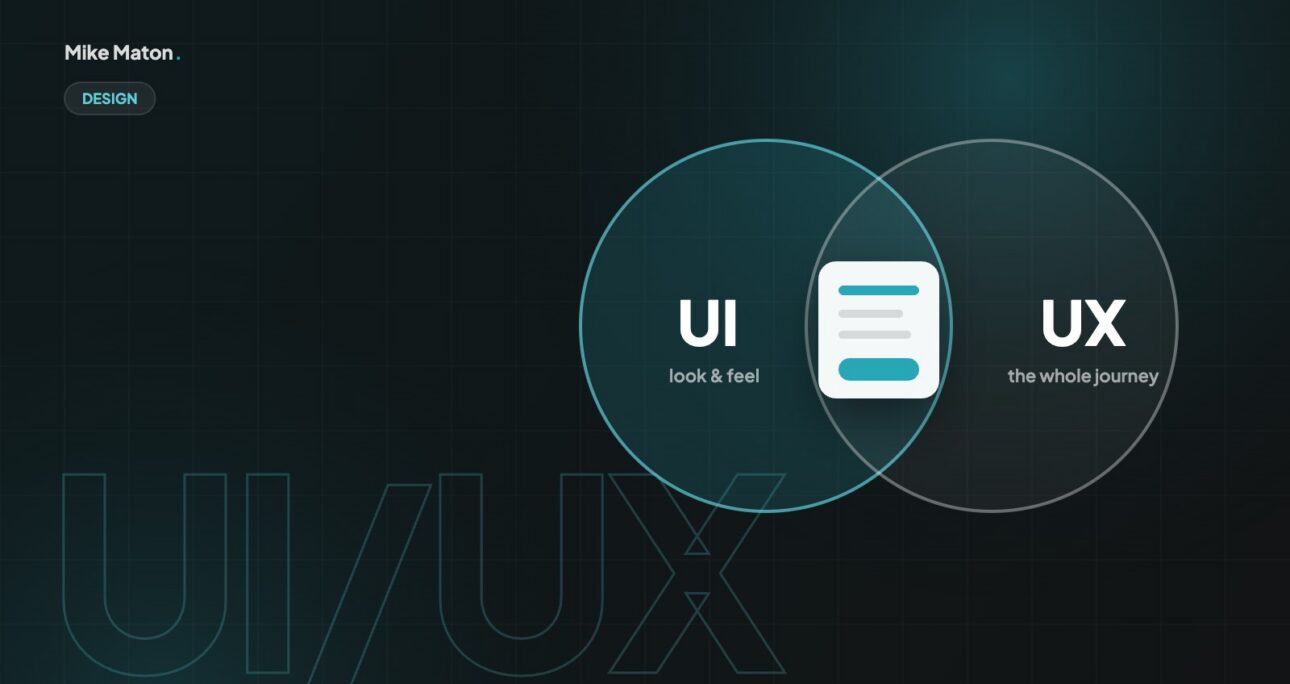
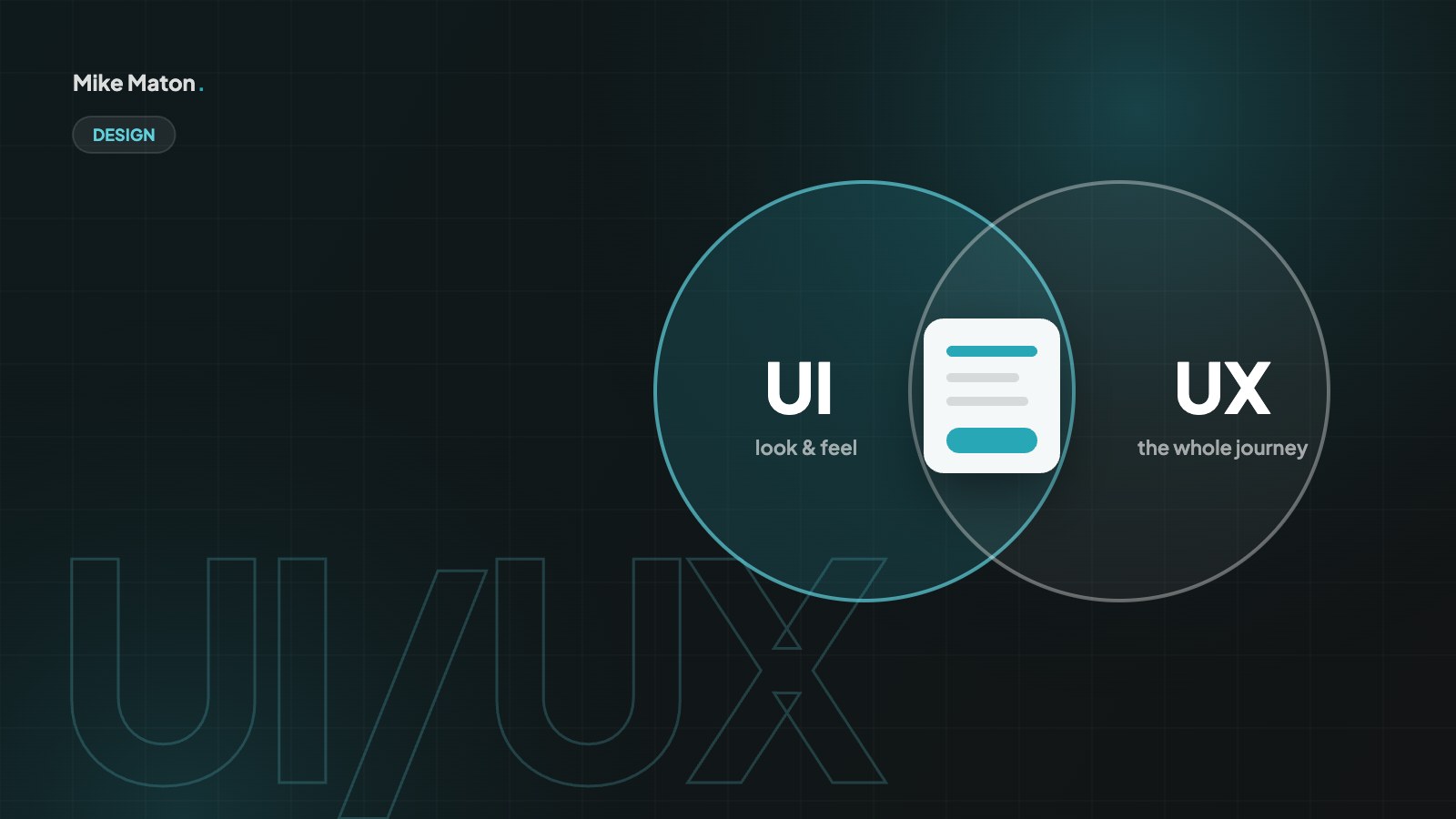
UI vs UX: the two terms are often used as if they mean the same thing. They do not. Knowing the difference helps you brief a designer, judge a website and spend your budget where it matters.

Key takeaways
- UI is how a product looks and responds. UX is how well it works for the people using it.
- A beautiful interface cannot save a confusing journey, and a great journey still needs a clear interface.
- The best results come from research, simple navigation and testing with real users.
01What UI means
UI stands for user interface. It is everything people see and touch: layout, colours, typography, buttons, icons, forms and how they react. Good UI is consistent, readable and makes the next action obvious.
UI design works at the level of individual screens and components. A UI designer decides how a button looks in its normal, hover, pressed and disabled states, how much space sits between form fields, which typeface is used for headings and how an error message appears. These decisions are collected in a design system, so the same component looks and behaves the same way everywhere.
Good UI is not about decoration. Consistency, contrast and clear feedback matter more than trends. When every button looks like a button, every link looks like a link and every action gives a visible response, people stop thinking about the interface and focus on their task. That is the first lesson of UI vs UX: the interface should be clear enough to disappear.
Accessibility is part of good UI too. Text that is large enough to read, colours with enough contrast, visible focus outlines for keyboard users and buttons with clear labels make the interface work for more people. They also tend to make it feel calmer and more professional for everyone.
02What UX means
UX stands for user experience. It is the whole journey: can people find what they came for, understand it and finish the task without frustration? UX covers structure, content, speed, accessibility and even what happens after the click, like a confirmation email.
UX design starts long before any screen is drawn. It begins with research: interviews with customers, analytics, support tickets and a look at how competitors solve the same problem. From that research comes a clear picture of who the users are, what they are trying to achieve and where they get stuck today.
The UX designer then shapes the structure: the site map, the navigation, the order of steps in a form or checkout and the content each page needs. Wireframes and simple prototypes test these ideas quickly before any visual design is done. In the UI vs UX comparison, UX is the plan for the whole journey, while UI is the finish on each step of it.
Content is a big part of UX that is often forgotten. Clear page titles, helpful descriptions, honest prices and answers to common questions do more for the experience than any animation. If people cannot find the information they need, the journey fails, however good the interface looks.
UI vs UX in one line: UI is what people see. UX is what people remember.
Mike Maton
03UI vs UX: how they work together
Think of a restaurant. UX is the whole visit: booking, finding the table, ordering, the wait and paying. UI is the menu design, the lighting and the plates. A stunning menu does not help if the kitchen is slow, and a great kitchen still needs a menu people can read.
The restaurant example shows why the UI vs UX question is not either-or. A beautiful menu cannot save a restaurant where you wait an hour for a table, and perfect service still suffers if the menu is impossible to read. On a website it is the same: a polished interface with a confusing structure frustrates people, and a logical structure with a messy interface feels untrustworthy.
In practice the two disciplines feed each other all the time. UX research might show that people miss the contact button, so the UI is changed to make it more prominent. A new UI component, such as a filter panel, might change how people move through a shop, which leads to new UX questions. Small teams often have one person covering both roles, which works well as long as both sides get proper attention.
04How I approach both
- Research first: who are the visitors and what do they need to do?
- Structure next: clear navigation and pages that answer one question each.
- Design the interface: consistent components, strong contrast and obvious calls to action.
- Make it accessible and fast, so it works for everyone on every device.
- Test with real people and improve based on what they actually do.
On every project I start with UX, even when the budget is small. A short list of user goals, a simple site map and rough page outlines take a few days at most, but they prevent expensive changes later. Only when the structure is agreed do I move into UI design, starting with a small set of components that can be reused across the site.
Testing closes the loop. I watch a few real people try to complete key tasks, such as finding a service or sending an enquiry, and note where they hesitate. Often the fix is a UI change, like clearer button text, but sometimes it is a UX change, like moving information earlier in the page. Either way, the goal in the UI vs UX balance is the same: make the next step obvious.
05UI vs UX: what it means for your website
If visitors say your site looks dated, you probably have a UI problem. If they say they cannot find things or give up halfway through a form, it is a UX problem. Most sites have a bit of both, and fixing the UX usually pays back first.
Analytics can point you in the right direction. High bounce rates on a landing page often mean the message or first impression is wrong, which can be both a UI and a UX issue. Forms with many started but few finished submissions usually point to UX problems, such as too many fields or confusing steps. Pages where people scroll back up repeatedly suggest they cannot find what they came for.
The good news is that many improvements are small. Clearer headings, fewer form fields, bigger buttons, better contrast and a simpler menu can make a noticeable difference in a few days. Bigger UX changes, such as restructuring the whole site, take longer but often deliver the biggest gains.
06UI vs UX: the key differences at a glance
When people ask me about UI vs UX, a simple comparison usually helps. Both aim for a website that people enjoy using, but they look at the problem from different distances.
- Focus: UI looks at screens and components, UX looks at the whole journey.
- Questions: UI asks how something looks and responds, UX asks whether it solves the problem.
- Methods: UI uses visual design, style guides and design systems, UX uses research, wireframes and testing.
- Deliverables: UI produces mock-ups and component libraries, UX produces site maps, user flows and prototypes.
- Success: good UI feels clear and consistent, good UX feels easy and leaves people satisfied.
Neither side is more important. A strong UX with a weak UI feels unfinished and less trustworthy. A strong UI with a weak UX looks impressive but leaves people lost. The best websites treat UI vs UX as two halves of the same job and plan time and budget for both.
07UI vs UX roles and skills
In larger teams, UI and UX are often separate roles. A UX designer or researcher spends time with users, analyses data, maps journeys and tests prototypes. A UI designer focuses on typography, colour, layout, icons, motion and the details of each component. Product designers often combine both, especially in software companies.
The skills overlap a lot. Both need empathy for users, an eye for detail and the ability to explain design decisions. UX leans more towards research, psychology and information architecture. UI leans more towards visual design, brand and front-end awareness, such as knowing how a component will behave when it is built in HTML and CSS.
For a small business website, you rarely need two specialists. What you need is someone who takes both sides of the UI vs UX equation seriously, asks about your users before talking about colours and checks the finished site with real people, not just on a large design screen.
08Common UI vs UX mistakes
Most problems I see on business websites come from mixing up the two, or skipping one of them entirely.
- Starting with visual design before agreeing the structure and content.
- Copying the look of a competitor without understanding why it works for them.
- Adding features because they are possible, not because users need them.
- Hiding navigation or key information to make the interface look cleaner.
- Testing only on large screens, while most visitors use phones.
- Judging the design by personal taste instead of by how real people use it.
The fix is usually to step back and ask what the visitor is trying to do on each page. Answer that first, and many UI decisions become obvious. Get it wrong, and even the most beautiful interface will not save the experience.
09UI vs UX and SEO
Search engines care about both sides of UI vs UX more than many people expect. Google measures how quickly the main content appears, how fast the page responds to taps and how much the layout shifts while loading. These Core Web Vitals depend on UI decisions such as image sizes, fonts and animation, and on UX decisions such as how much is loaded on each page.
Structure matters too. A logical site map, clear internal links and descriptive headings help people and search engines understand what each page is about. When visitors find what they need quickly, they are less likely to return to the search results and try another site, which is good for your business and a positive signal for your visibility.
10Getting UI vs UX right on your next project
If you are planning a new website or a redesign, you can protect both sides of UI vs UX with a few simple habits. None of them need a big budget, but together they make the difference between a site that only looks good and one that also works.
Start with a clear brief. Write down who the website is for, what they need to do and what you want them to do. Add the questions customers ask most often and the reasons they choose you over competitors. That short document guides every UX and UI decision that follows.
Next, agree the structure before any visual design. A simple site map and page outlines, even sketched on paper, show whether visitors can reach every important page in a couple of clicks and whether each page has a clear purpose. Changing a box on a sketch takes seconds; changing a finished design takes days.
When the design starts, ask for a small set of reusable components rather than unique layouts for every page. Buttons, cards, forms, navigation and content blocks that work on every screen size make the site consistent and easier to maintain. They also make it easier to add new pages later without breaking the look.
Before launch, test the key journeys with three to five people who match your audience. Ask them to find a service, compare options and get in touch, and watch quietly. You will learn more in an hour than in a week of internal discussion, and most fixes will be quick.
After launch, keep measuring. Look at which pages people land on, where they leave and which forms they complete. Small, regular improvements based on real behaviour are the most reliable way to keep both UI and UX working well over time.
- Write a short brief with users, goals and common questions.
- Agree the site map and page outlines before visual design.
- Build with reusable components that work on every screen.
- Test key journeys with real people before launch.
- Review analytics and improve in small steps after launch.
11UI vs UX questions
Which comes first, UI or UX?
UX usually comes first. You need to understand users and agree the structure before designing screens. In practice the two overlap, and good teams move back and forth between them throughout the project.
Is UI vs UX the same as front-end vs back-end?
No. Front-end and back-end are development terms. UI and UX are design disciplines. A front-end developer builds the UI in code, but both UI and UX decisions affect what the developer builds.
Can one person do both UI and UX?
Yes, especially on smaller projects. Many designers, including me, cover research, structure and visual design. Larger products often split the roles so each can go deeper.
How do I know whether my website has a UI or UX problem?
If people say the site looks dated or untrustworthy, start with UI. If they say they cannot find things, give up on forms or call to ask questions the site should answer, start with UX. Watching a few people use the site usually makes the answer clear.
What tools are used for UI vs UX work?
UX work often uses analytics, surveys, user interviews, card sorting and prototyping tools. UI work uses design tools such as Figma and a shared design system. The tool matters much less than talking to real users.
Checklist
Spot the problem
- 1People cannot find key pages: UX
- 2The site looks dated: UI
- 3Forms are abandoned: UX
- 4Buttons are hard to spot: UI
- 5Pages are slow: both
Keep reading
More from the blog.
Your website
Want a site that gets this right?
Tell me what you are building. I will come back with ideas, a plan and a clear price.