Design · 12 min read
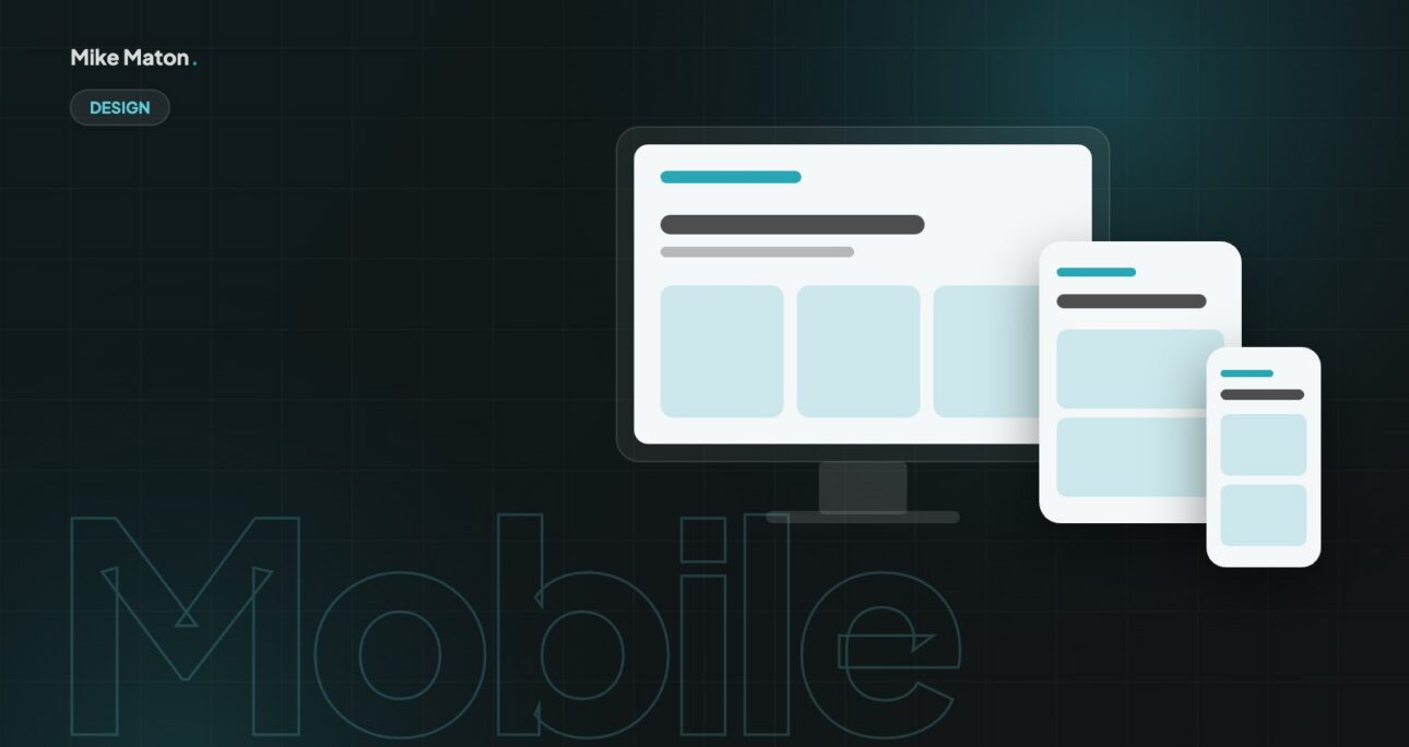
Best Practices for Responsive Design: How to Create a Website That Looks Great on All Devices
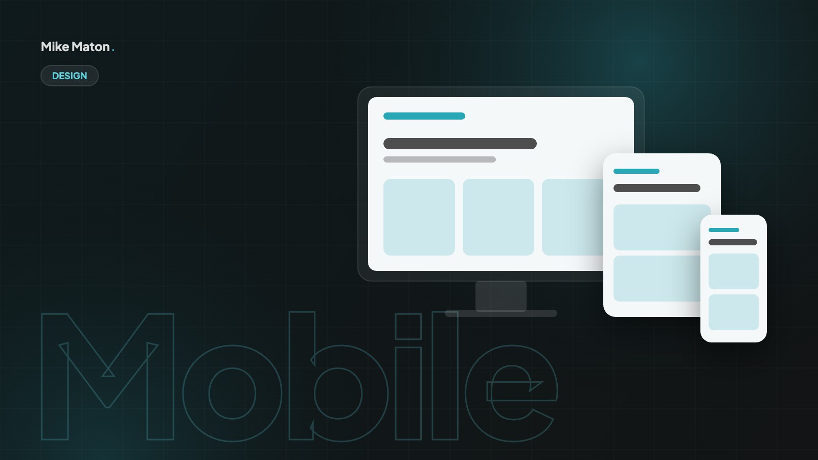
Most visits now start on a phone. Responsive design adapts the layout, images and interactions of a site to every screen, from a small phone to a wide desktop. These are the responsive design practices I follow on every build.

Key takeaways
- Good responsive design starts mobile first, then adds complexity for bigger screens.
- Use fluid layouts, flexible images and breakpoints based on content.
- Test on real devices, with real thumbs and slow connections.
01Responsive design starts mobile first
Starting with the smallest screen forces clear priorities: what does a visitor need first? Once the mobile layout works, adding columns and detail for tablets and desktops is easy. Going the other way usually leads to cramped, cluttered phone pages.
Mobile-first responsive design also changes how you write. On a phone, the first screen has room for a headline, a short line of value and one button. If that is enough to explain what you do, the page is in good shape. If it is not, the problem is usually the message, not the layout, and adding more boxes on desktop will not fix it.
In practice I sketch the mobile layout before anything else, section by section, and only then decide where a second or third column helps on larger screens. CSS media queries that start from the small screen and add rules with min-width keep the code simpler too, because the base styles stay lean and each breakpoint only adds what it needs.
Starting small also keeps scope under control. Every extra element you want on desktop has to earn its place, because it has to be designed, built and tested on every screen. That discipline is one of the quiet benefits of responsive design: it pushes the whole team towards clearer, simpler pages.
02Use fluid layouts
Modern CSS with flexbox and grid lets content flow naturally. I set sizes in relative units and use breakpoints where the content needs them, not for specific devices. Spacing and font sizes can scale smoothly between a minimum and a maximum.
Fluid layouts are the heart of responsive design. Instead of fixed widths in pixels, columns use percentages, fractions or the flexible units of CSS grid, so they grow and shrink with the screen. A three-column grid of cards can become two columns on a tablet and one column on a phone without any separate layout for each device.
Fluid type and spacing take the idea further. With the CSS clamp() function, a heading can be 34 pixels on a small phone and 56 pixels on a wide desktop, scaling smoothly in between. The same works for section padding and gaps. The result is a page that looks deliberate at every width, rather than one that only looks right at a few chosen breakpoints.
I set breakpoints where the content breaks, not at the width of a particular phone. Resize the browser slowly and watch for the moment a line becomes too long, a card too narrow or a menu too crowded. That is where a breakpoint belongs. Devices change every year, but content-based breakpoints keep working.
If it works beautifully on a phone, it is easy to make it work on a desktop. The other way round is much harder.
Mike Maton
03Make images responsive
- Serve the right image size for each screen with srcset.
- Use modern formats like WebP or AVIF where possible.
- Lazy-load images below the fold and always set width and height to prevent layout jumps.
Images are usually the heaviest part of a page, so responsive design has to include them. The srcset and sizes attributes let the browser choose the right file for each screen, so a phone downloads a small image instead of a large desktop version. WordPress generates these sizes automatically, but it is worth checking that your theme uses them and that the original uploads are not unnecessarily huge.
Art direction is the other half. A wide landscape photo that works on desktop can turn into a tiny strip on a phone. With the picture element, or simply with careful cropping and object-fit in CSS, you can show a tighter crop on small screens so the subject stays visible. Always set width and height on images so the browser reserves space and the layout does not jump while the page loads.
04Design for thumbs
Buttons and links need enough room to tap, ideally around 44 pixels high, with space between them. Important actions should sit where thumbs reach easily. Hover effects are a bonus, never the only way to discover something.
Touch is a different way of using a page. There is no hover, fingers are less precise than a mouse pointer and people often hold the phone in one hand. Responsive design that respects this gives buttons enough height, keeps related links far enough apart and avoids tiny close icons in corners that are hard to reach.
Forms deserve extra care. Use the right input types so phones show the correct keyboard, such as a number pad for phone numbers and an email keyboard for email addresses. Keep labels visible above fields rather than inside them, and make error messages clear and close to the field. A form that is easy to complete with a thumb usually converts better on every device.
Think about where thumbs naturally rest. On a large phone held in one hand, the bottom and middle of the screen are easy to reach, while the top corners are a stretch. Placing the main action lower on the screen, or repeating it at the end of each section, makes the page easier to use without changing the overall design.
05Keep navigation simple
A clean mobile menu with a handful of clear items beats a long list of links. I keep the main call to action visible and make sure search and contact details are one tap away.
Responsive design is not only about the main content. Navigation is often the first thing that breaks on smaller screens. I keep the main menu short, use clear labels people already understand and make sure the menu opens and closes smoothly with a large, obvious button. For bigger sites, a well-organised menu with grouped sections works better than long lists of links.
Sticky headers can help on long pages, but they also take space away from content on a small screen. I keep them slim on mobile and make sure they never cover form fields or important buttons. The contact button or main call to action can stay visible, so visitors can act the moment they are ready.
Search deserves a place in the mobile menu on larger sites. A visible search field, rather than a tiny magnifying glass, helps people who already know what they want. On smaller sites, a short list of clear links and a direct contact button is usually all the navigation a responsive design needs.
06Test on real devices
Browser tools are a good start, but nothing replaces a real phone. I check every page on iOS and Android, in portrait and landscape, on a slow connection. That is where the small problems show up: text that wraps badly, a table that scrolls sideways or a cookie banner that hides the button.
A simple testing routine catches most problems. I check every key page at a few widths in the browser, then on at least one iPhone and one Android phone, in both portrait and landscape. I also test with the text size increased in the phone settings, because many people use larger text and a responsive design should still hold together.
Performance testing belongs here too. Tools like PageSpeed Insights show how the page performs on a mid-range phone with a slower connection, which is much closer to real life than a fast office laptop. If a page is slow or jumps while loading on mobile, it is not finished, however good it looks on a large screen.
07Responsive design and accessibility
Good responsive design and good accessibility overlap a lot. Both are about making sure everyone can use the page, whatever their device, screen size or abilities. Readable text, strong contrast, clear focus states and logical heading order help people on small phones as much as they help people using screen readers or keyboards.
Zoom is a good example. Some sites block pinch-to-zoom to keep the layout tidy, but that makes the page harder to use for anyone who needs larger text. A properly responsive design allows zoom and reflows the content into a single column, so nothing is cut off and no sideways scrolling is needed.
- Never disable zoom in the viewport settings.
- Keep body text at 16 pixels or more on mobile.
- Make sure every button and link has a visible focus state.
- Check that content reflows without horizontal scrolling at 320 pixels wide.
08Common responsive design mistakes
Most responsive design problems come from the same few habits. They are easy to spot once you know what to look for, and most of them are quick to fix.
- Hiding important content on mobile instead of reorganising it.
- Using fixed widths that cause sideways scrolling on small screens.
- Loading desktop-sized images on every phone.
- Relying on hover effects to reveal links or information.
- Placing pop-ups that cover the whole screen and are hard to close.
- Testing only in a desktop browser window instead of on real devices.
Hiding content is the most damaging of these. Search engines index the mobile version of your site, so content that only exists on desktop may as well not exist. Responsive design should show the same information on every device, arranged to suit the screen.
09Responsive design and SEO
Google uses mobile-first indexing, which means it looks at the mobile version of a page to decide how to rank it. A responsive design that serves the same HTML to every device, with layout adapted by CSS, is the approach Google itself recommends, because there is only one version of each page to crawl and understand.
Speed and stability matter as well. Core Web Vitals measure how fast the main content appears, how quickly the page responds to taps and how much the layout shifts while loading. A lean responsive design with optimised images, careful font loading and reserved space for media usually scores well on all three, and that supports both rankings and conversions.
Structured content helps too. Clear headings, short paragraphs and descriptive link text make a page easier to read on a small screen and easier for search engines to understand. In that sense responsive design, accessibility and SEO all pull in the same direction.
10Planning a responsive design project
A responsive design project goes more smoothly when the planning starts with content rather than screens. Before any visual design, I list the sections each page needs, the order they should appear in on a phone and the one action each page should lead to. That simple outline becomes the backbone for every screen size.
Next comes a small design system: a type scale, a spacing scale, a colour palette and a set of reusable components such as buttons, cards, forms and navigation. Each component is designed to work from 320 pixels wide upwards. When the building blocks are responsive on their own, every page built from them is responsive too, and adding new pages later is much faster.
Analytics help you prioritise. Look at which devices and screen sizes your visitors actually use, which pages they land on and where they leave. On most small business websites, more than half of visits come from phones, so the mobile experience of the top landing pages deserves the most attention. I also check which browsers are common, so testing covers the ones that matter.
Finally, agree how the site will be tested and signed off. A short checklist of pages, devices and key tasks, such as reading a service page, filling in a form and finding contact details, keeps everyone focused on how real people use the site. Responsive design is finished when those tasks are easy on every screen, not when the desktop mock-up looks perfect.
- Outline content and page order for mobile first.
- Build responsive components before full pages.
- Use analytics to decide which pages and devices matter most.
- Agree a simple test checklist before launch.
11Responsive design questions
What is the difference between responsive and adaptive design?
Responsive design uses one flexible layout that adjusts smoothly to any screen. Adaptive design serves a few fixed layouts for specific screen sizes. Responsive design is easier to maintain and handles new devices better, which is why it is the standard approach today.
Do I still need a separate mobile site?
No. A separate mobile site, often on an m. address, means two versions to maintain and more room for mistakes. A single responsive website is simpler, cheaper to run and better for SEO.
How many breakpoints should a responsive website have?
As many as the content needs, which is usually three or four. I set them where the layout starts to look wrong, rather than for specific devices, and use fluid sizing in between.
Can an existing website be made responsive?
Often, yes. Many older sites can be improved with updated CSS, responsive images and a new mobile menu. If the theme is very old or built with fixed layouts, a rebuild is usually faster and gives a better result.
How do I check whether my site is responsive?
Open it on your own phone and try to complete the main task, such as finding a service and sending an enquiry. Then resize your browser window slowly on a computer. If anything overlaps, scrolls sideways or becomes hard to tap, your responsive design needs attention.
Checklist
Responsive launch checklist
- 1No sideways scrolling on any page
- 2Tap targets are big enough
- 3Images are sized and compressed
- 4Text is readable without zooming
- 5Tested on iOS and Android
Keep reading
More from the blog.


Your website
Want a site that gets this right?
Tell me what you are building. I will come back with ideas, a plan and a clear price.